Like Font: A Warm, Handwritten Script for Digital Branding
It started with a hero section. I was redesigning a coaching website—soft tones, ample whitespace, a gentle image background—and the headline just felt… flat. The clean sans serif I’d used for months suddenly lacked warmth, personality, the quiet confidence of a real human voice. So I swapped it in: Like. Just one word—“Clarity”—set in Like, sized large, overlaid on a muted linen texture. Instantly, the page exhaled. Not louder—but *kinder*. More intentional. That’s when I knew this wasn’t just another script font—it was a subtle but powerful tone-shifter for digital experiences.
What Makes Like Feel Authentic—Not Just Decorative
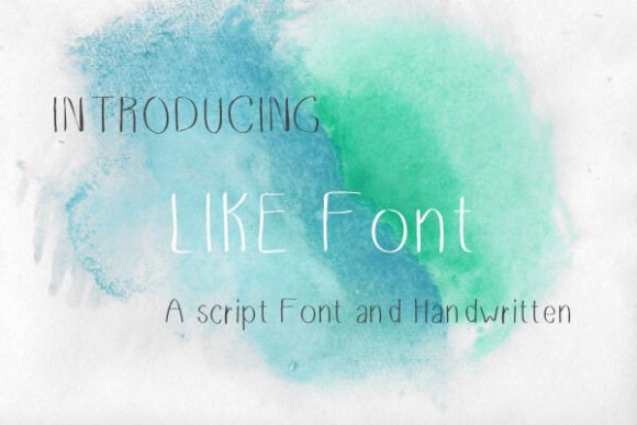
Like is a true handwritten script font from Script Amp, delivered in both OTF and TTF formats—so it’s ready for web use via @font-face or embedded in design tools like Figma and Webflow. What sets it apart isn’t flourish overload or exaggerated bounce; it’s restraint. The letterforms have natural variation in stroke weight, slight irregularity in baseline alignment, and a gentle, chalkboard-inspired rhythm—like something written slowly, thoughtfully, with a soft-tip marker. There are no forced swashes or dramatic ligatures cluttering the flow. Instead, there’s authenticity: a lowercase “a” that leans just slightly, a “g” with an open, friendly loop, an “s” that curves like a breath. It feels personal without feeling precious.
Where Like Shines in Real Web Layouts
I tested Like across several live contexts—not just mockups, but actual staging environments with real breakpoints and loading conditions:
- Landing page headlines: Perfect at 48–72px on desktop, scaling cleanly down to 36px on mobile (with generous line-height). It holds presence without sacrificing legibility—even over semi-transparent image overlays.
- Section dividers & subheadings: Used as a secondary type layer beneath a strong sans serif (we paired it with Inter), it adds warmth to otherwise functional content blocks—like “What You’ll Learn” or “Your Journey Starts Here.”
- CTA buttons (sparingly): At 20px with tight tracking and 1.2 line-height, it works beautifully on primary action buttons—especially on sites with a creative, artisanal, or wellness-focused identity. Just avoid it on small utility buttons or mobile navigation menus.
- Digital brand kits: Included in a client’s brand guidelines as their “voice accent” font, Like appears only in hero text, quote callouts, and signature email footers—never in body copy or forms. That consistency made their visual language instantly recognizable across platforms.
Readability & Responsiveness: What Works (and What Doesn’t)
Here’s what I learned after testing Like on iOS Safari, Chrome desktop, and Firefox on Windows:
✅ It reads well on light and dark backgrounds—as long as contrast meets WCAG AA (we tested with #333 on #fff and #e9ecef on #2d2d2d). Its medium stroke weight avoids the fragility of ultra-thin scripts.
✅ It scales gracefully—no pixelation or hinting issues at any size above 24px. On mobile, we added a small media query to bump letter-spacing by 0.5px at under 480px—just enough to keep rhythm clear.
❌ Avoid using it for body copy, form labels, or navigation links. It’s not designed for dense reading—and shouldn’t be. Its strength is emotional resonance, not information density.
❌ Don’t force it into tiny UI elements: anything under 16px becomes ambiguous (the “e” and “c” start to blur; the “r” and “n” can read similarly). Save it for moments where you want attention—and meaning—to linger.
Smart Pairing for Balanced Digital Typography
Like thrives when grounded. We consistently paired it with Inter (a highly legible, open-source sans serif) for all body copy, captions, and interface text. The contrast is gentle but effective: Like brings warmth and voice; Inter brings clarity and function. For more editorial or luxury-leaning sites, we’ve also paired it successfully with IBM Plex Serif—its soft serifs echoing Like’s organic feel while keeping hierarchy crisp.
Crucially, Like includes no alternate glyphs, stylistic sets, or multiple weights—so it’s refreshingly simple to implement. No need to manage complex CSS font-feature-settings. Just load the regular OTF, declare it as a display font in your typography scale, and use it where human connection matters most.
Licensing & Practical Integration Notes
Like is licensed for commercial web use—including client projects, SaaS dashboards (for decorative headings only), online stores, and digital templates—as long as you’re using the OTF/TTF files directly (not converting to SVG or embedding in downloadable fonts for resale). Always verify the license covers your use case—especially if distributing branded assets or white-labeled web products. It supports basic Latin characters (no extended diacritics or Cyrillic), so it’s ideal for English-first brands, coaching sites, creative portfolios, and boutique e-commerce—but double-check multilingual needs before committing to global-facing pages.
In the end, Like isn’t about making things look “handmade.” It’s about making them feel human. In a web landscape full of algorithmically optimized, frictionless, perfectly aligned interfaces, sometimes what users remember—and return to—is the quiet sincerity of a single, well-placed word, written like it means something. That’s the space Like lives in. And honestly? It fits right in.